No Car and 30 Minutes to Get There: Visualizing Bike Superiority for Car-Free Transit
Alright, alright... before we dive into this extra short blog post (because hopefully the cover photo tells you everything you need to know) let's run through the usual -
Events This Week:
Thursday @ 7:30am: Coffee Outside at TBL
Thursday @ 4PM-7PM: Green Grill-Out
Saturday @ 2PM: Lake Raleigh Adventure Series #2 (Details and Signup)
Sunday @ 6PM: Thanksgiving Potluck at TBL (Sign up here to bring a dish)
Bing bang boom.
So apparently this Thursday is GIS day. I don't really know much about technical stuff and all the newfangled things the kids do these days like Python and R and C++ (is that the same thing as C Sharp?), but earlier this year I did take a Coursera course on GIS and it changed my life.
At the time I was unemployed and in desperate need of marketable skills – no employers really seemed to be digging what I had to offer between the engineering and business degrees, and TBL was still spooling up. That left me with plenty of time to sink into building new skills and to distract myself from the panic that inevitably comes from not having a paycheck in this economy.
Fast forward a few months and I am scheduled for New Employee Orientation at one of the most inaccessible-by-anything-other-than-car locations in the City, so, being me, I made it a point (and an act of protest) to get there by any means other than a car. I documented that somewhat harrowing journey here.
Okay, so we have these two pieces of the puzzle now:
- A rudimentary knowledge of GIS software.
- A burning desire to show the world that bikes are the superior mode of urban transit.
I rediscovered this cool software called Traveltime which I previously used in this blog post when I really sucked at GIS (those are screenshots) and The Bike Library was still a fledgling in the nest.
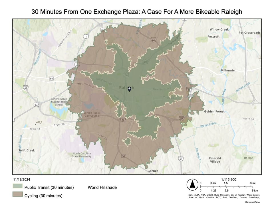
In order to create the shapes, I created a few .geojson files of the biking and transit isochrones. Isochrones are just the outlines of the distance you can travel in 30 minutes from a certain point using those two modes of transportation. I put the starting point at One Exchange Plaza. I got this map as the output:

I am not entirely sure of the backend functionality of Traveltime, and I do have some questions about how the isochrones are calculated. Most of the shape looks fine, but some areas cause me to raise an eyebrow. I believe the Public Transit isochrone includes walking time to/from the bus stop.
However, I think the map gets it about right. It passes the sniff test. The main corridors on the transit isochrone look about right. The bike blob looks about right, too.
Completely Unbiased Verdict: Bikes Win Every Time.
That's all for today, folks.

Comments ()